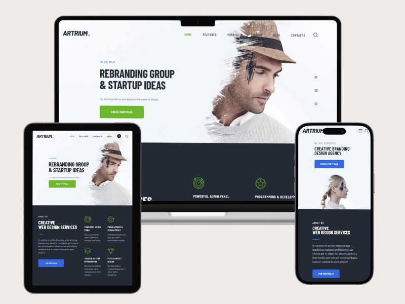
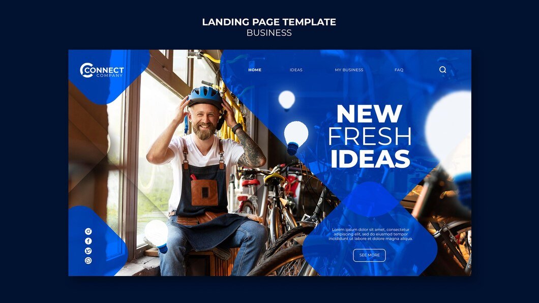
Ensuring your Pilates website looks great on all devices is crucial in today’s digital landscape where users access information from smartphones, tablets, and desktops. Responsive design plays a pivotal role in providing a seamless and enjoyable browsing experience across various screen sizes and devices. Here’s how to ensure your Pilates website is effectively optimized for responsiveness:
1. Adopt a Mobile-First Approach
- Design Strategy: Start with designing for mobile devices first, considering the constraints of smaller screens. This approach helps prioritize essential content and functionalities, ensuring they are accessible and usable on mobile.
- Progressive Enhancement: Gradually enhance the design and layout for larger screens (tablet and desktop) by adding more features, improving navigation, and optimizing content presentation without compromising usability.
2. Flexible and Fluid Layouts
- Grid Systems: Utilize grid-based layouts that can dynamically adjust and rearrange content based on screen size. Grid systems facilitate consistent alignment and spacing across devices, maintaining visual harmony.
- Flexible Images and Media: Use CSS techniques like max-width: 100% to ensure images and media scale proportionally to fit smaller screens while maintaining quality on larger screens.
3. Optimize Navigation for All Devices
- Hamburger Menu: Implement a collapsible navigation menu (often represented by three horizontal lines) for mobile devices. This conserves screen space while providing access to all website sections.
- Clear Navigation Paths: Ensure navigation links and buttons are easily clickable and accessible, especially on touchscreens. Use a sticky header for desktop users to maintain navigation accessibility as they scroll.
4. Content Prioritization and Readability
- Hierarchy of Information: Organize content based on importance, placing essential information such as class schedules, services, and contact details prominently at the top for easy access.
- Font Sizes and Contrast: Use legible font sizes (at least 16px for body text) and ensure sufficient contrast between text and background colors. Avoid text-heavy paragraphs and opt for concise, scannable content.
5. Enhance User Interaction and Engagement
- Call-to-Actions (CTAs): Make CTAs prominent and actionable, encouraging visitors to book classes, sign up for newsletters, or contact the studio. Use contrasting colors and clear messaging to draw attention.
- Interactive Elements: Incorporate interactive elements such as sliders, galleries showcasing Pilates exercises, and testimonials from clients. These elements enhance engagement and provide a visual representation of your services.
6. Optimize Performance and Loading Speed
- Image Optimization: Compress images without sacrificing quality to reduce page load times. Consider lazy loading techniques to prioritize content above the fold while images further down load as users scroll.
- Minimize Scripts and Plugins: Limit the use of JavaScript and plugins to essential functionalities to streamline performance. Optimize CSS and JavaScript files to reduce render-blocking and enhance loading speed.
7. Testing Across Devices and Browsers
- Device Testing: Regularly test your website across various devices (smartphones, tablets, desktops) and operating systems (iOS, Android) to ensure consistent functionality and visual appeal.
- Browser Compatibility: Verify compatibility across popular web browsers (Chrome, Safari, Firefox, Edge) to accommodate diverse user preferences and ensure a seamless browsing experience for all visitors.
8. Accessibility Considerations
- Accessibility Standards: Adhere to web accessibility guidelines (WCAG) to ensure your website is accessible to users with disabilities. Provide alternative text for images, support keyboard navigation, and maintain a readable contrast ratio.
- User Feedback and Iteration: Gather feedback from users through surveys, analytics data, and usability testing. Use insights to iteratively improve your website’s responsiveness, usability, and overall user experience.
Conclusion
By prioritizing responsive design principles, you can create a Pilates website that effectively engages visitors across all devices, enhances user experience, and drives conversions. A well-optimized responsive website not only attracts new clients but also retains existing ones by providing easy access to information and services. Continuously monitor performance metrics and user feedback to refine your design and ensure your Pilates website remains visually appealing and functional on every device Responsive Pilates Website Design.
