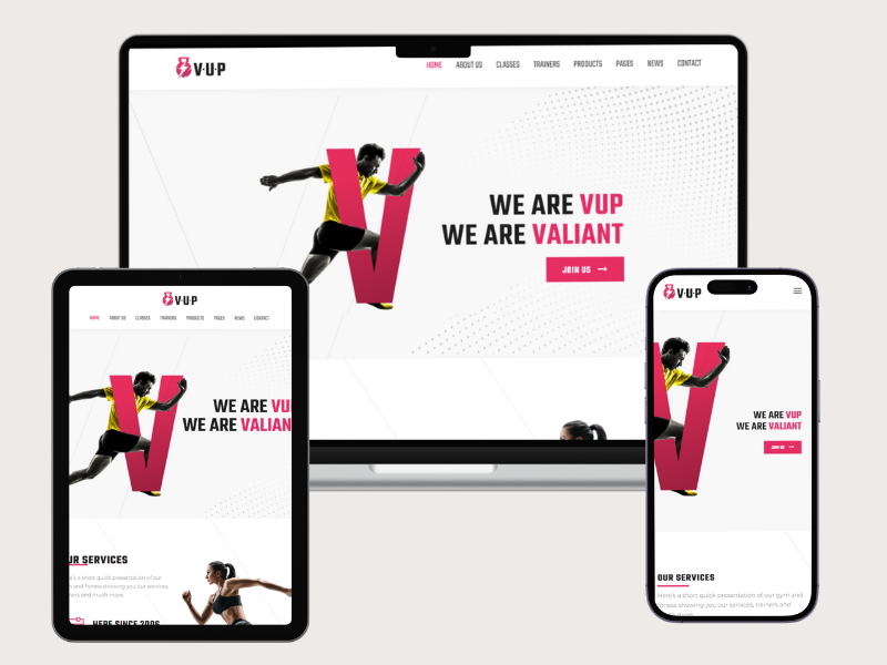
Navigation and menu design are critical components of a fitness website’s user experience (UX), directly impacting how visitors find information, engage with content, and navigate through your site. Here are some best practices to ensure your navigation and menu design effectively support usability, engagement, and conversion on your fitness website best practice fitness website:
1. Keep it Simple and Intuitive
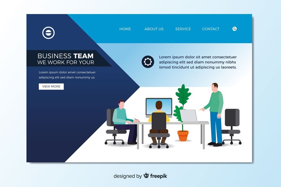
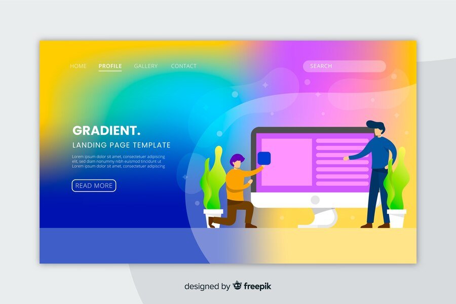
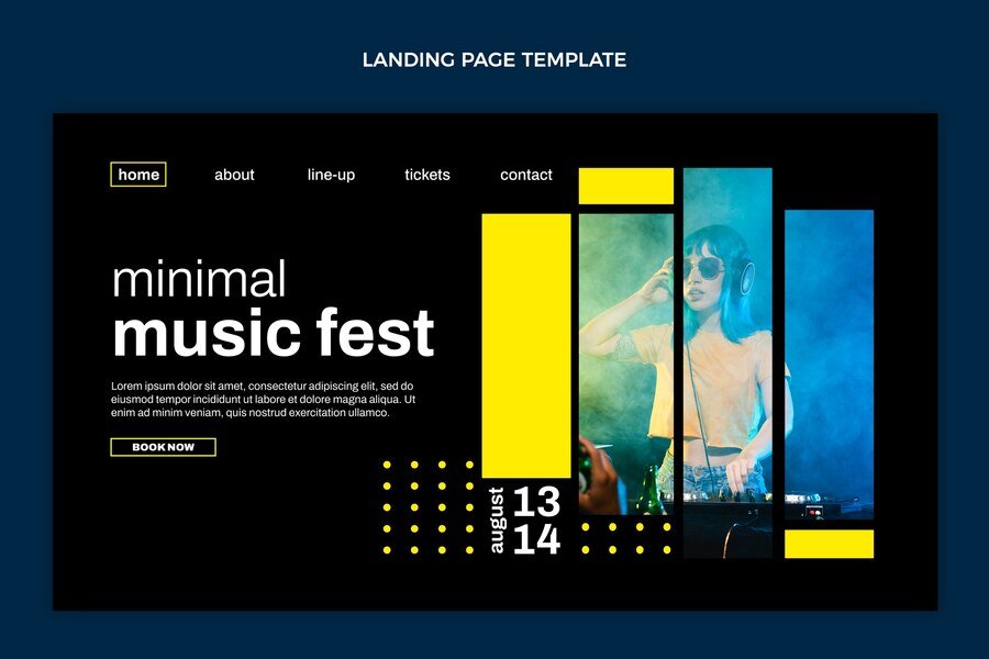
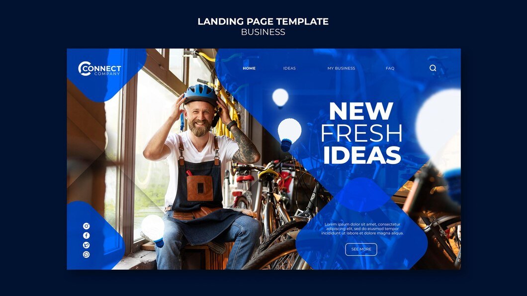
- Clear Structure: Design a clear and logical hierarchy for your navigation. Use main categories (e.g., Home, About Us, Services, Blog, Contact) that reflect the primary areas of your fitness business.
- Consistent Placement: Place the main navigation menu in a standard location where users typically expect to find it, such as across the top or along the side. Avoid unconventional placements, as they may confuse users and disrupt the overall user experience. By maintaining familiar navigation structures, you enhance usability and ensure that visitors can easily find what they’re looking for.
- Limit Menu Items: Too many menu items can overwhelm visitors. Aim for 5-7 main menu items to keep navigation concise and focused. Use dropdown menus or submenus for additional categories if necessary, but avoid overly deep hierarchies.
2. Responsive Design for Mobile Users
- Mobile-Friendly Navigation: Ensure your menu is optimized for mobile devices. Use a hamburger icon (three horizontal lines) for mobile menus to save space and provide easy access to navigation options.
- Thumb-Friendly Navigation: Place important menu items within easy reach of a user’s thumb on mobile devices. Consider the natural hand position when designing touch-friendly navigation elements.
3. Visual Design and Navigation Aids
- Visual Cues: Use visual elements such as icons or arrows to indicate dropdown menus or subcategories. Visual cues help users quickly understand the structure of your navigation without relying solely on text.
- Hover States: Implement hover effects for desktop users to highlight menu items and indicate interactivity. Ensure these effects are subtle and responsive to enhance usability.
4. Prioritize Important Content
- Highlight Key Pages: Prioritize important pages such as services, classes, pricing, and testimonials in your main navigation. These are typically the pages that potential clients or members seek first.
- Call-to-Action (CTA) Placement: Incorporate prominent CTAs within your navigation to encourage actions like booking a consultation, signing up for a trial, or joining a class. Make these CTAs stand out visually to attract attention.
5. Accessibility and Usability
- Readable Font and Contrast: Use readable fonts and ensure sufficient color contrast between text and background to improve readability, especially for users with visual impairments.
- Keyboard Navigation: Ensure all menu items can be accessed and navigated using keyboard shortcuts. This is essential for users who rely on keyboard navigation or screen readers.
6. Analytics and Testing
- Monitor User Behavior: Use analytics tools (e.g., Google Analytics) to track user interactions with your navigation. Identify popular pages, drop-off points, and areas needing improvement based on user flow data.
- A/B Testing: Experiment with different menu designs, placements, or wording to optimize navigation based on user preferences and behavior. A/B testing can reveal insights into what drives better engagement and conversions.
7. Feedback and Iteration
- User Feedback: Gather feedback from users through surveys, usability testing, or direct inquiries. Use this feedback to identify pain points or areas where users struggle with navigation and make necessary adjustments best practice fitness website.
- Continuous Improvement: Website navigation is not static. Regularly review and update your navigation based on user feedback, analytics insights, and industry trends to ensure it remains effective and user-friendly.
Conclusion
Effective navigation and menu design on your fitness website are crucial for enhancing user experience, engagement, and conversions. By implementing best practices such as keeping navigation simple and intuitive, optimizing for mobile users, and using visual cues, you can ensure a seamless browsing experience. Prioritize important content, ensure accessibility, and test and analyze performance to refine your site. Additionally, iterate based on feedback to continuously improve. Ultimately, these strategies encourage visitors to explore your fitness services, engage with your content, and take action toward achieving their fitness goals. A well-designed navigation system not only enhances usability but also reflects positively on your brand’s professionalism and commitment to user satisfaction best practice fitness website.
