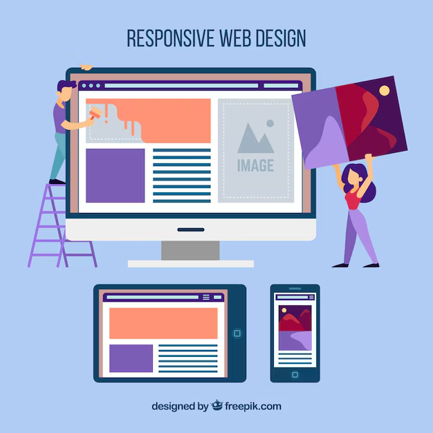
Creating a responsive WordPress website involves adhering to key design principles that ensure your site functions seamlessly across various devices and screen sizes. Here are the essential design principles to follow:
1. Mobile-First Approach
- Importance: Design for mobile devices first, considering their constraints and capabilities, then progressively enhance for larger screens.
- Implementation:
- Fluid Grid Layouts: Use percentage-based widths for elements instead of fixed pixels to allow flexibility.
- Flexible Images and Media: Use CSS techniques like
max-width: 100%;to ensure images and videos scale proportionally. - Content Priority: Prioritize content that matters most on mobile screens, ensuring a focused and streamlined user experience.
2. Flexible and Scalable Typography
- Importance: Ensure readability and accessibility across devices by using responsive typography that adjusts to different screen sizes.
- Implementation:
- Viewport Units: Use
vw,vh,vmin, andvmaxunits for font sizes to scale with the viewport. - Relative Units: Use
em,rem, or percentages for line-height and spacing to maintain readability across devices. - Line Length: Adjust line lengths for optimal reading experience on different screen sizes.
- Viewport Units: Use
3. Media Queries for Breakpoints
- Importance: Utilize CSS media queries to apply specific styles based on screen width, optimizing layout and content presentation for different devices.
- Implementation:
- Breakpoints: Define breakpoints where your design adjusts, typically for mobile, tablet, and desktop sizes.
- CSS Flexbox and Grid: Use modern layout techniques like Flexbox and CSS Grid for more complex layouts that adapt to different screen sizes.
4. Optimize Navigation for Touch
- Importance: Ensure navigation menus and links are easy to access and use on touch screens, enhancing user experience on mobile devices.
- Implementation:
- Thumb-Friendly Targets: Ensure menu items and buttons are large enough to tap comfortably with a finger (minimum 48×48 pixels).
- Sticky Navigation: Implement sticky headers or menus for easy access to navigation options as users scroll down long pages.
- Collapsed Menus: Use hamburger menus or collapsible navigation to save space on smaller screens while still providing access to all navigation options.
5. Performance Optimization
- Importance: Improve loading times and user experience by optimizing assets and reducing unnecessary requests.
- Implementation:
- Image Optimization: Compress images without compromising quality using tools like Photoshop or plugins such as Smush.
- Minification: Minify CSS, JavaScript, and HTML files to reduce file sizes and improve load times.
- Lazy Loading: Implement lazy loading for images and videos to defer loading until they come into view, reducing initial page load time.
6. Accessibility (ADA Compliance)
- Importance: Ensure your website is accessible to users with disabilities, meeting ADA (Americans with Disabilities Act) standards.
- Implementation:
- Semantic HTML: Use proper HTML5 tags (
<nav>,<header>,<main>,<footer>, etc.) to create a clear structure for screen readers. - Alt Text: Provide descriptive alt text for images to aid visually impaired users and improve SEO.
- Keyboard Navigation: Ensure all interactive elements are accessible via keyboard navigation without relying solely on mouse interactions.
- Semantic HTML: Use proper HTML5 tags (
7. Cross-Browser Compatibility
- Importance: Test your website across different browsers (Chrome, Firefox, Safari, Edge, etc.) and devices to ensure consistent functionality and appearance.
- Implementation:
- Browser Testing Tools: Use browser testing tools or services to check compatibility and identify any issues that may arise.
- Vendor Prefixes: Use CSS vendor prefixes (
-webkit-,-moz-,-ms-,-o-) where necessary to ensure CSS properties render correctly across different browsers.
Conclusion
By following these key design principles, you can create a responsive WordPress website that provides a seamless and optimized experience across all devices. Prioritize usability, accessibility, and performance to ensure your website meets the needs of modern users and stands out in a competitive online landscape.